3 easy ways to make your vignettes or photos stand out
Have you ever wondered why some displays or photos look so good, and other are just plain boring? Here are three simple ways to give them that extra special something.
#1 Pick a theme. Whether it’s a color, a type of decor, a time period or even be a combination, try to find a common ground. I find one of the easiest ways to get a cohesive look is to go with a color scheme - in this case red, white, and black. You could also easily gather a collection of similar items, such as brass or silver items, candlesticks, pitchers, wooden kitchen utensils, spice tins, books or glassware. Or you can go with a specific season, such as springy decor, ocean themed items for summer, or a grouping of Santas for Christmas. This little collection below is not only primarily red, white and black, but also farm animal and kitchen related items.
Sure, you could throw in a random item or two such as seashell or a favorite vintage Avon perfume bottle, but that would just look really weird! The bottom line is, put things together that make sense together.
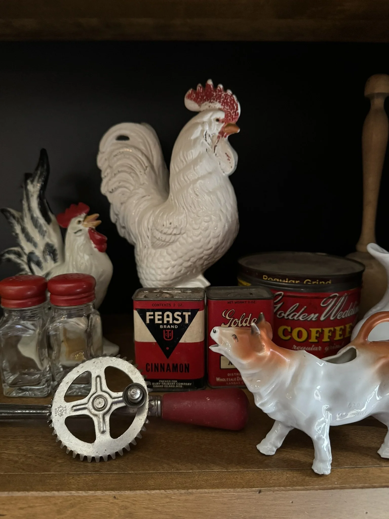

#2 Stagger and layer your objects instead of just lining them up. These two photos have the exact same items in them. The only difference (aside from the slight improvement in lighting) is how the items are arranged. The photo on the left has the objects lined up on the shelf, with the majority of the items in the mid ground, and the cow creamer and whisk in the front. The two chickens in the back simply sit next to each other.
The photo on the right has a few tweaks. Notice how the 2 chickens are layered one in front of the other. The cute white pitcher is perched on top of the coffee tin, and the spice tins are stacked as well. The salt and pepper shakers are moved forward to catch the light, and one is lying on its side. And my grandma’s cow creamer is now angled slightly forward instead of straight sideways, and the hand beater is tucked slightly behind it and angled as well.

The final result & tip #3
A couple of finishing touches give this vignette a little extra something-something
#3 Soften it up. I’m absolutely in love with vintage doilies and linens. I can’t seem to take a photo or set up any kind of a vignette anywhere without using at least one doily, linen or lace element. My other go-to is greenery or any kind of floral element.
Now I’m obviously not a professional photographer! I just really enjoy creating vignettes for my home or my antique booth, and I have always loved gardening (again, another thing I realize I got from my grandparents) and old linens and lace. So I guess it should come as no surprise that I gravitate toward adding these elements into my ‘scenes’. I think they add a little extra touch of texture, softness and femininity. If you don’t like florals, go for greenery -it’s less ‘girly’. If you don’t care for lace, grab a doily, or even a tea towel or flour sack. Even a piece of burlap could work. In other situations, you could use something like a glove or a handkerchief. Even a stack of old books can work wonders to add texture, color, and height. In a case like this, I would tend to use a stack of cookbooks, if anything.
You don’t want to have your shelf or table crammed with a bunch of random objects though. Though it is nice to add objects for texture and interest, don’t add things just for the sake of adding things. Do it thoughtfully. In this case, a doily and crocheted hot pad make much more sense than a lace handkerchief or a pair or garden gloves.
Below is another example of 3 photos with the same 3 items, except each image has added elements and tweaks.

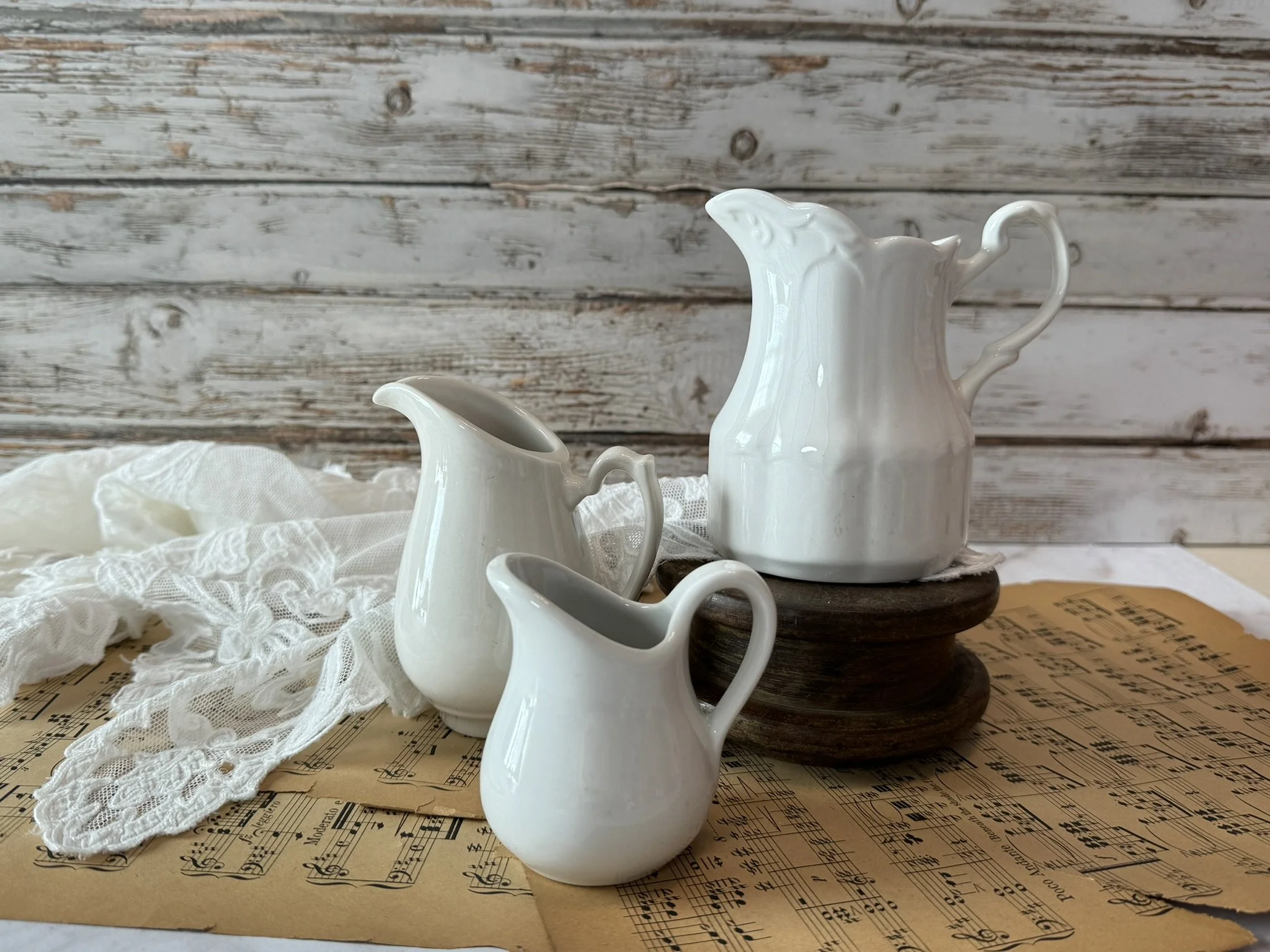

As you have may have noticed, the photo on the left is a bit darker than the other two, even though there is some sun streaming through the window blinds. The second, or middle photo, is more balanced, more evenly lit, and has a touch of lace to add some softness and texture.
Adjusting the blinds to eliminate the direct stream of light for the second photo helped to even out the super bright spot that was on the left side of the first photo. A piece of white foam board to the right helps to reflect the light a little and even out the shadows. The largest pitcher is also smack dab in the middle, which leaves the right side of the photo feeling empty and unbalanced overall.
The second, or middle photo, is more balanced, more evenly lit, and has a touch of lace to add some softness and texture.
The third image on the right has an added sprig of lilac, and the background is slightly blurred, compliments of the portrait mode feature on my iPhone. These are all subtle differences, but I feel the one on the right catches your eye a bit better than the first two. It also doesn’t hurt that the lilacs are pink {wink wink}. In case you hadn’t already figured this out, pink is my favorite!
Here’s a final example of how a couple of added elements can make a more interesting image
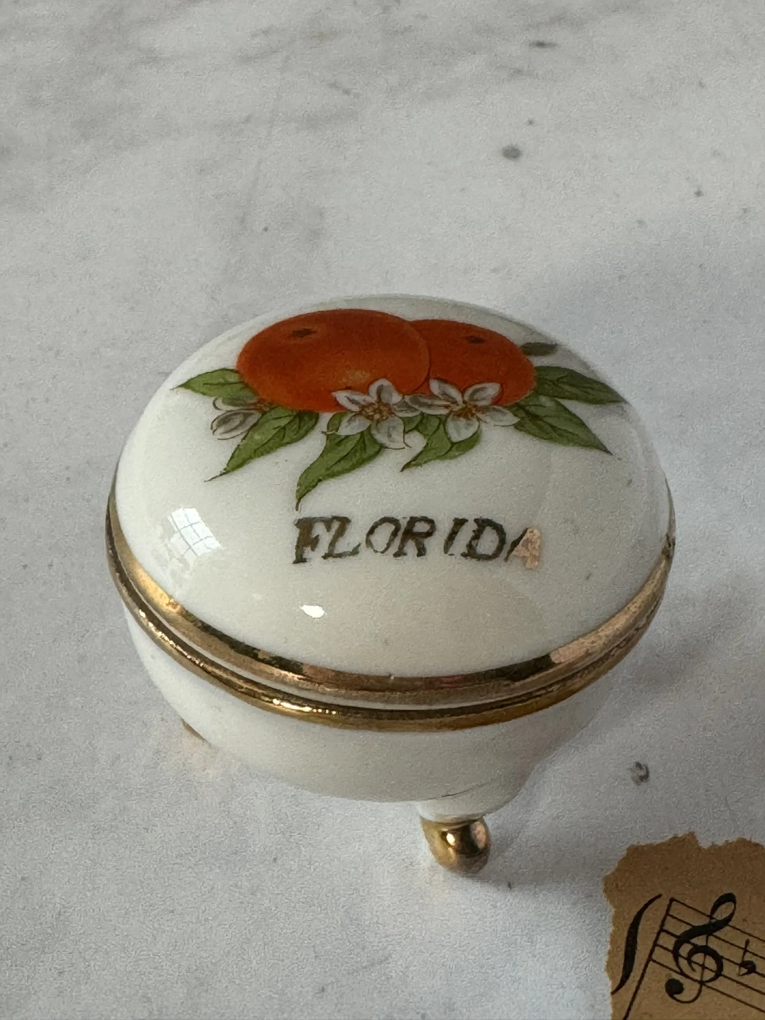
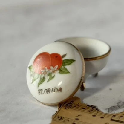
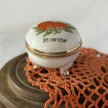
While I think the first two photos might be fine for a product listing, I love the added interest that the flat spool and unusual orange crocheted doily lend to the image! Now a flat wooden spool is something some people would pass by when shopping, because they would have no idea what to do with it. But doesn’t it make a cute riser for the little trinket box?
So if you are struggling to make sense of what you have and how to put it together, remember these 3 key things: Theme, layer, soften. Don’t be afraid to think outside the box. Look at things in a new way, and don’t be hesitate to use a book or spool as a riser, or lay something on its side just because you can. And most of all, have fun and PLAY!